Range Visualization with Kibana: (Always) Start with Lens
From a recent question on Twitter:
[How can you] create a visualization like the below? Based on access logs, I want to see percentages of requests answered within 1s, 2s, 5s and 10s, over time.
Just pointing me in the right direction would probably help. Should I use Vega, Lens, Visualize,… something else? Or am I thinking in the wrong way?
Excellent question and something pretty common, so here is a quick run-through from the initial approach to the final visualization.
Where Should You Start? #
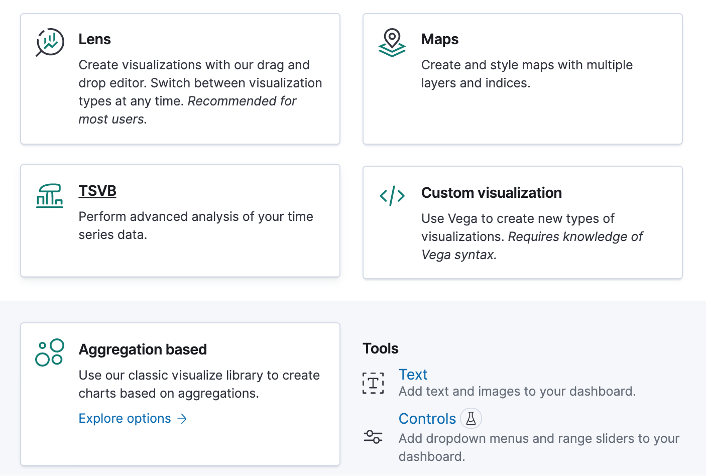 Kibana has accumulated many different visualization types over time. But when you want to create a new one, the menu is already trying to guide you, as shown by the screenshot (Kibana 7.13):
- If you don’t know where to start, pick Lens since it’s versatile and beginner-friendly.
- Unless you want a map, then go with Maps.
- If you want to visualize a time series and need specific features like calculations or annotations that aren’t (yet) available in Lens, select TSVB, which stands for Time Series Visual Builder and is sometimes called Visual Builder for short.
- If nothing else does the job and you need an escape hatch, pick Custom visualization, which lets you create Vega visualizations. Tons of options but also complexity — there might be 🐲 waiting for you on this one.
- There is also the now mostly redundant Aggregation based visualizations though there should be very few scenarios where you’d have to fall back to those.
- Text and Controls both have their place but are much less common and won’t be helpful for the graph above.
Diving into Kibana Lens #
So how can you create a similar visualization like the one above? Metricbeat has a good dataset with event.duration in nanoseconds for this visualization:
Example:
{
  "_index": "metricbeat-7.13.1-2021.06.15-000001",
  "_type": "_doc",
  "_id": "cjxfEHoB_nPKlQ3D_niZ",
  "_version": 1,
  "fields": {
    "event.duration": [
      8723623
    ],
    ...
}
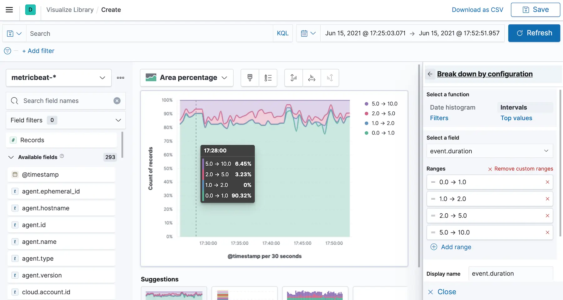
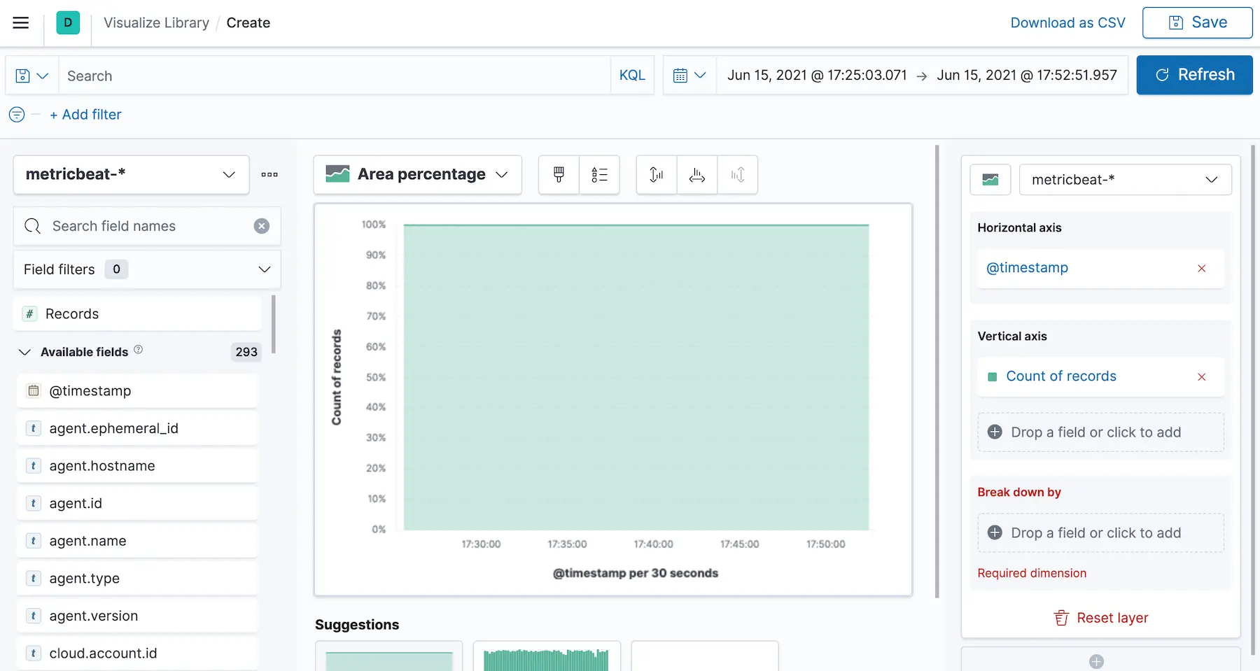
The first step is to drop the Records into the visualization area, which puts @timestamp on the horizontal axis and the Count of records on the vertical one. Then switch from Bar vertical stacked to Area percentage.
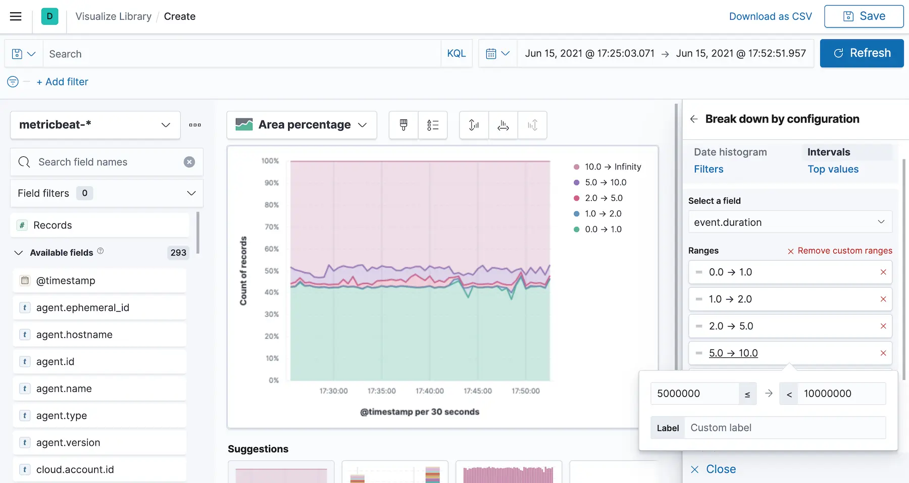
Break down by with Intervals on the event.duration field with Create custom ranges. Set the ranges from 0 to 1000000 (these are nanoseconds), 1000000 to 2000000,…
Optionally set the Visual options to Curve lines and on the Bottom axis disable Gridlines.
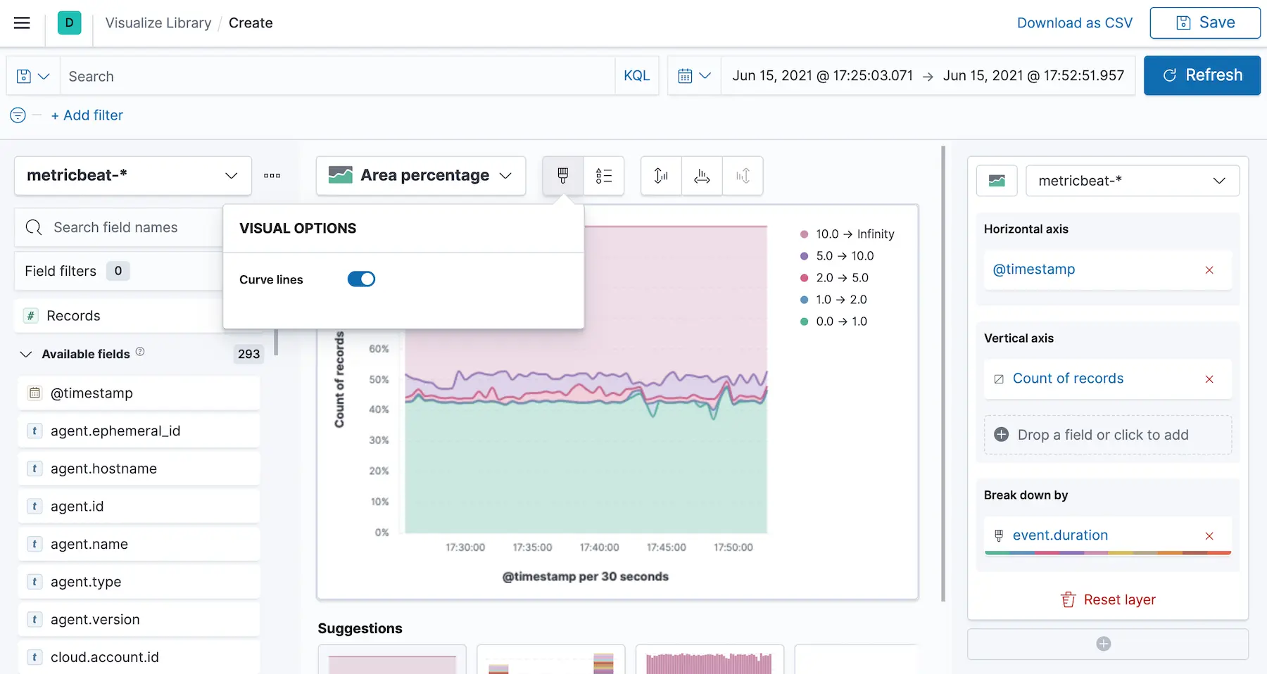
The current state should be pretty close to the desired visualization — done!
And if you want to see the creation step by step, here is a recording of it:
Conclusion #
Once you know where to start, it is relatively straightforward: Lens unless you have a reason for something else. It’s still adding new features in every release and will cover more and more use-cases. So if in doubt, start exploring in Lens.
Final note because I did that wrong at first: Be sure to include Infinity in your last interval. Otherwise, your visualization might look different — somewhere between misleading and wrong.